The Russian New University decided to celebrate the anniversary year of 2021 not with a redesign, but with a rebranding. Since the last redesign, quite a long time has passed. The old corporate identity is obsolete, so it was resolved to develop a new one for the thirtieth anniversary of the university.
"The decision from the university management that it was time for changes came at the end of 2019. We started looking at the references, accumulated, and revised the material," Anton recalls.
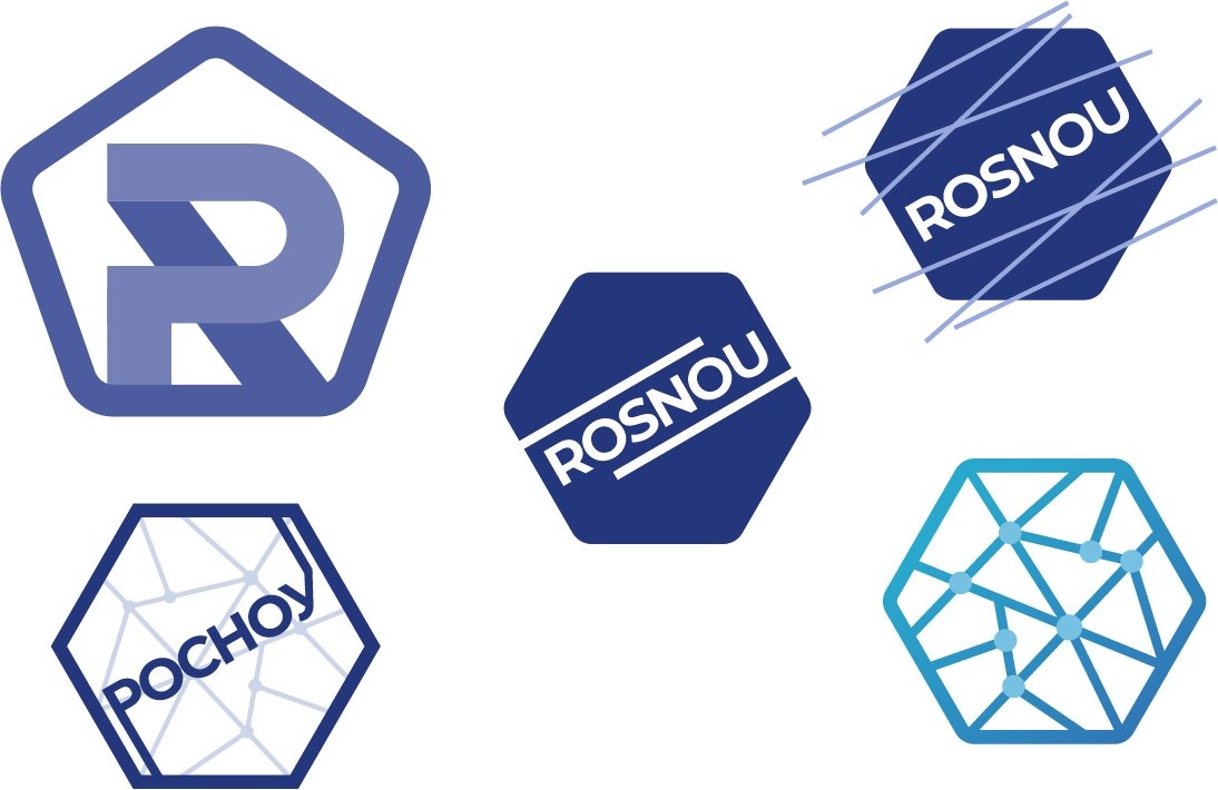
At first, the creative team tried to fit the name of the university — RosNOU – into the new logo. "We tried to carry the burden of the past," says Natalia. - The peak of the search for options fell at the beginning of the summer of 2020. A lot of sketches were reviewed and rejected every day. This lasted for about two months — until the moment when we decided to dramatically change the direction of work and with it the concept of the new logo."
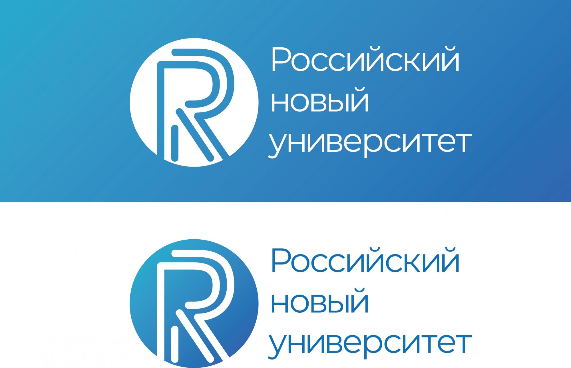
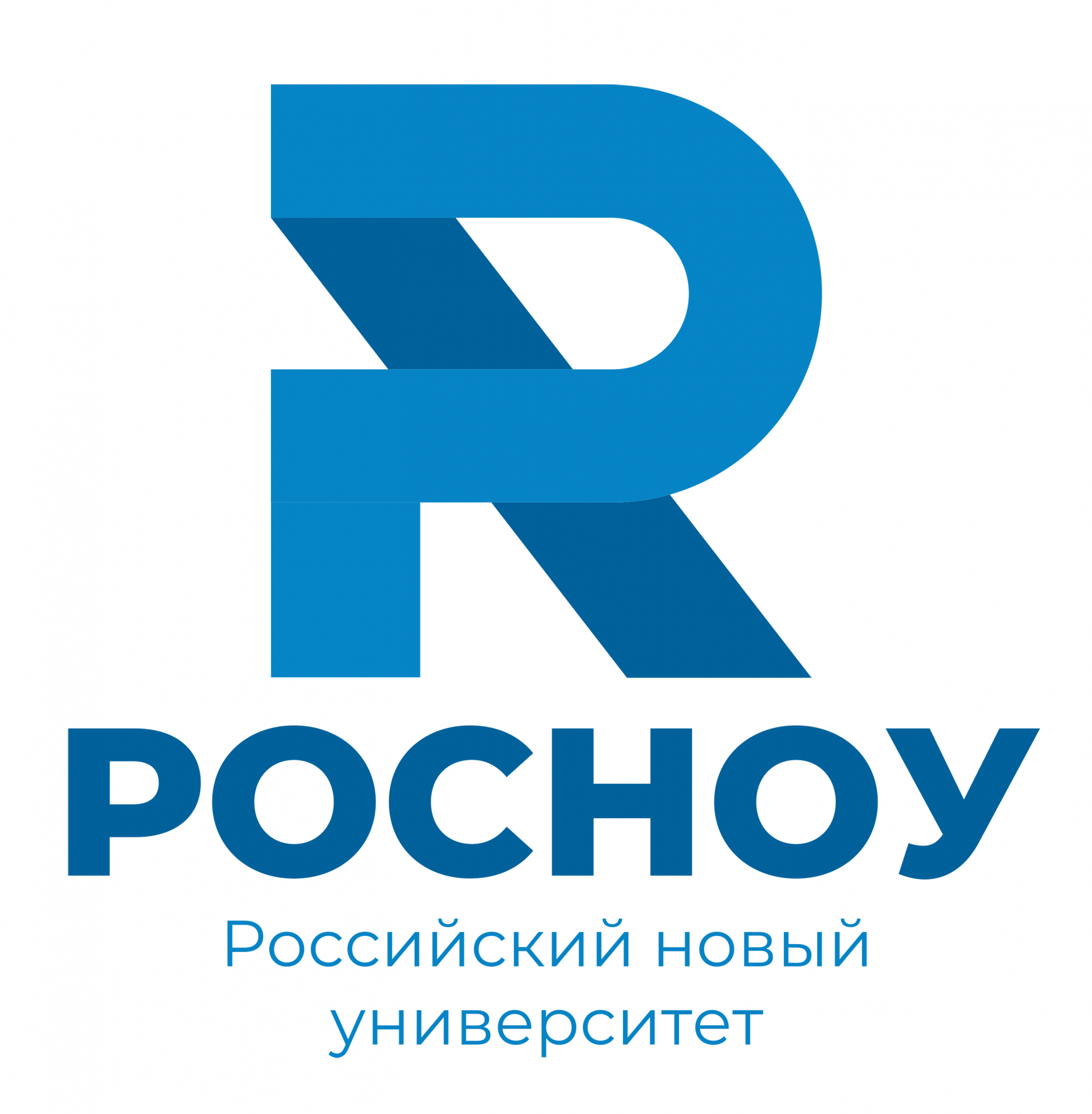
"The logo was made up of two letters "R"— Cyrillic (P) and English (R)," says Anton. – “Combining two letters is a common move in the design. In our case, this reflects the direction of the university's work. RosNOU pays a lot of attention to international cooperation with other universities."
First, the double letter was written in the pentagon of the quality mark. However, placing it there with the minimum number of voids was difficult.
"At some point, Anton removed this pentagon. We looked and realized: this is it!" - recalls Natalia.
The only thing left of the old RosNOU logo is the blue color.
"We followed the classic pattern of brand development: the unification of services, brands, and products," says Natalia. – “So, the institutes of the Russian New University have become sub-brands. The corporate colors assigned to each institute were updated as part of the rebranding. A new shade was chosen for each of them — brighter for some institutions, softer for others. For example, the black color assigned to the Institute of Information Systems and Computer Engineering Technologies of RosNOU was replaced by the shade "Cuttlefish Ink".
"Today, the university is not just an educational institution; it is an aggregator of services and opportunities for students and other universities," says Natalia. – “We have studied the resources that we can provide to students, and this has changed our perception of RosNOU. For us, the university is no longer just an educational institution; it is a major brand."
